The Design Process
One of the main tasks that I’m currently focusing on is designing the fundamental content of Project Prosper. You might now be aware, from the social media profiles (@projectprosper_ on Instagram & Twitter / @projectprosperuk on Facebook) that the project will consist of twelve individual forms that unlock for download on the 1st of every month.
Originally I thought that twelve forms are all that will be required, however, to make the project user-friendly I’m considering designing, an information document as well as an introduction to the project. The information document will consist of things such as how to make the most of joining project prosper and how things will run throughout the year. The goal is to make the experience run smoothly for the users so they get familiar with the project and are able to complete the twelve-month course accurately and gain the relevant skills and knowledge.
About the project
During my first year at the University of Loughborough, I developed the project as a means of helping myself get back on the right track and focus my mind on overcoming certain challenges I was facing at the time. Back then project prosper didn’t have an identity, it was just a list of things I did every day to get myself into the right mind frame to help me focus on what’s important.
Process of designing the content
Now onto the visual designing. Once the backbone of the project was in place I could design the way it was going to be delivered to the users.
At the beginning of designing, I revisited the drawing board multiple times as ideas were trialled and analysed only to realise that the idea wasn’t the most cost-effective way to deliver the project, or the idea just wasn’t good enough. Being able to go back and forth to the drawing board and start again is something I quickly learn on my Graphic Communication course. Sometimes it’s better to let a bad idea go rather than wasting time trying to push something that’s never going to happen.
The final idea of capturing the project on easily deliverable A4 pdf files was decided. It was the most cost-effective, environmentally friendly and can be accessed by a simple download.
Below are pictures showing the process I carry out in order to finalise each of the twelve forms. Starting with ideation, development and then finalising the form.
Ideation
I always begin by reviewing the theme of the form for that month to focus the design on visuals relevant to the form. For example, below I’m brain storming visuals for a form titled ‘Wake up for success’ I began by writing a few key words and sketching illustrations of the words. My aim is to create clear aesthetic forms that enhance the experience of project prosper users.
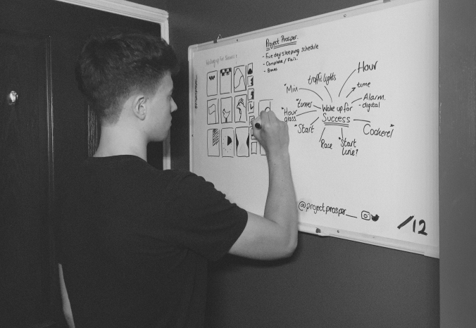
Quick brain storm of key words and illustrations.
Development
Once I’m happy with the concept in terms of aesthetics and function, I then develop the ideas in Adobe Illustrator and create various versions to try to test which design works best on the 210 x 297 dimensions (A4 Size)
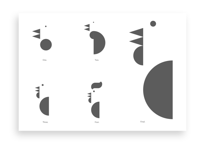
Digital development.
Finals
When the visuals have been finalised I then turn my attention on displaying the information around the visual design. Although the information is more important than the visuals and it would make sense to carry out the process in reverse order focusing on the displaying the text first followed by the visuals. I believe that it would hinder the creativity of the information display as every visual aspect I design is different and takes up a different amount of space on the page. This means that I need to lay out the text accordingly to the illustrations, hence making the information layout different every time for every form I design.
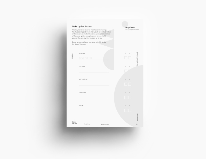
Finalised form.
When everything is in place I add small details to the A4 document for example titles, icons, logo, the number of the month. All of these are placed in the same position in all of the forms I have created so far. I do this for consistency. Being able to familiarise the user to the brand makes the brand recognition stronger, and easier to identify. I also plan to use the same layout of these smaller details in my social media posts and other visual elements. Here’s an example.

Final touches by adding branding and titles.

Similar details in social media posts.
Notes:
- Maximise user experience through clear content and layouts.
- Going back to the drawing board is not always a waste. It could save you valuable time and recourses in the future.
- Keep visual identity consistent throughout all mediums to increase brand awareness and familiarise the users with the brand in order to gain their trust.
Blog Entry #Two
Hello! My name is Bartek Marzec I’m a 19 y/o undergraduate student, Designer and an aspiring entrepreneur. I will be updating you on my journey of starting my own business and launching Project Prosper by sharing with you all the things that happen behind the scenes.
Thank you for reading.

